

"We drew the line at adding anything that gets in the way of reading."
5/14/2011

5/05/2011

5/02/2011
My Posters meet IKEA's frame
Putting all together and preparing for assessment!
Love the frame, it just fits perfectly and nicely!


For the other 5 posters, I used the black clips. So, the exhibition would looks lively instead of using 10 frames and it would be looks very boring.

ALL PACKS and ready to Go! :)

Love the frame, it just fits perfectly and nicely!

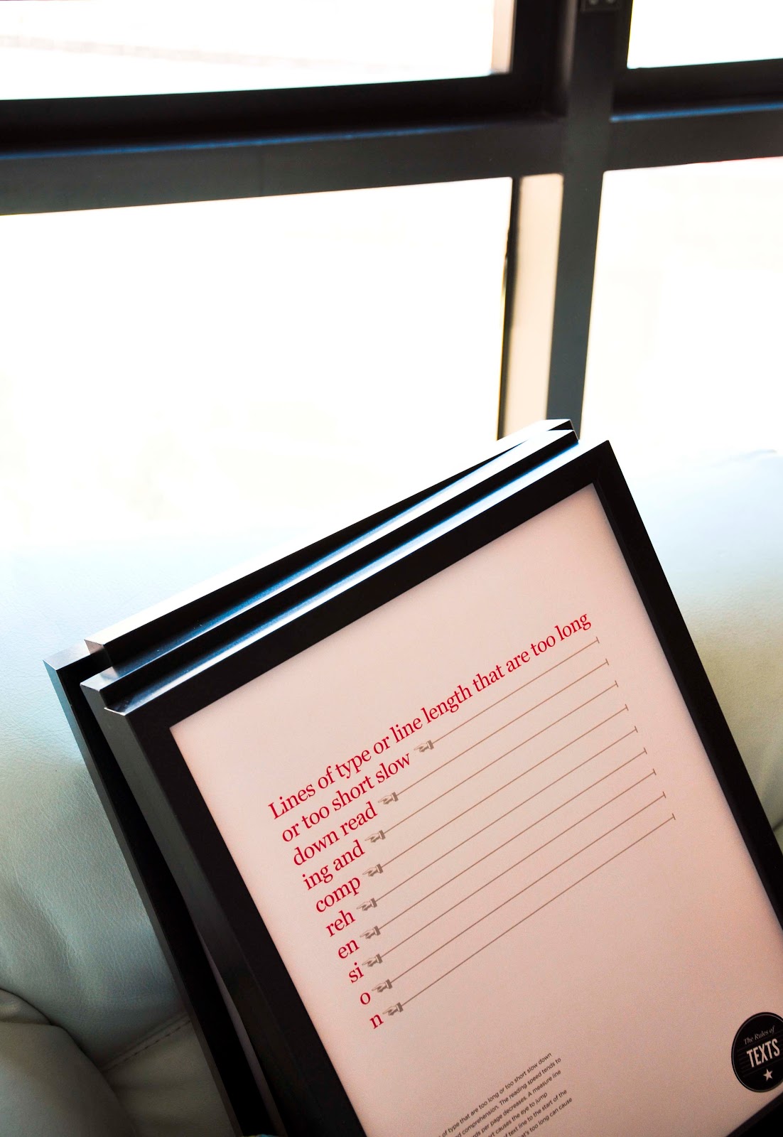
For the other 5 posters, I used the black clips. So, the exhibition would looks lively instead of using 10 frames and it would be looks very boring.

ALL PACKS and ready to Go! :)

5/01/2011
Guide for screen body text
Hope I could have time to build this... I have an idea to build guide body text on website itself. However, I could manage my time to create it. My idea come from this website called twopaperdolls.com
in this website, they have interesting overlay from the background and other layer (which I thought it could be my guide for web) and the background would be other website. I think if the user can type any URL in the box (that i could provide in my website) the background would change into other web, but the guide would stay there. Here is what the website look like:

in this website, they have interesting overlay from the background and other layer (which I thought it could be my guide for web) and the background would be other website. I think if the user can type any URL in the box (that i could provide in my website) the background would change into other web, but the guide would stay there. Here is what the website look like:

IKEA, I'll meet you soon.
After planning the exhibition, it is the time to check and look up where I can find all things that I need. so, I need a frame... uncle Google is really helpful for this. So, I look up many places who create or sell a wood frame.


and finally,
everything was solved by IKEA. I can even check the stocks at their website!
I Love You IKEA, and we'll be meeting soon. I plan to go there on Sunday!


and finally,
everything was solved by IKEA. I can even check the stocks at their website!
I Love You IKEA, and we'll be meeting soon. I plan to go there on Sunday!


4/30/2011
Best quotes for this project!
"Right and wrong do not exist in graphic design. There is only effective and non-effective communication."
— Peter Bilak - Illegibility
4/29/2011
Testing the cheat posters
I tried to do some user testing (while I'm doing my test print) and I find most people understand the message! good!
Below is the possible 2 colors that I tried to print and compare which one is the best for the last final assessment.


I got a FEEDback!
Love my friends who always give me critiques for improvement, discussions, and suggestions! Today's feedback is from Jordan, who do the font dictionary and include the purpose of the fonts. (I want his dictionary, but he didn't allowed me :'( hiks...)
I did the 'GUIDE FOR BODY TEXT' (click to see the older post) it is a transparent paper with the leading and line length as well as the font size to help designer define and compare the new guideline (my reading efficiency guide) and the normal guide. They could use for any books and learn from it.
Therefore, I called Jordan, since he also a designer of and asked if he found this useful and handy to be used. So.. I got a feeeeedback!! (happy)
He said:
BIG THANKS to Jordan!! What a really good feedback! I will fix it for my final outcome. Good luck for you final assessment buddy!
I did the 'GUIDE FOR BODY TEXT' (click to see the older post) it is a transparent paper with the leading and line length as well as the font size to help designer define and compare the new guideline (my reading efficiency guide) and the normal guide. They could use for any books and learn from it.
Therefore, I called Jordan, since he also a designer of and asked if he found this useful and handy to be used. So.. I got a feeeeedback!! (happy)
He said:
"I think you should put all the guidelines you have into one single page instead of many page. the grids of combination leading and line length could be divided into 4 since you have showed 4 different type size. Moreover, I think the size should be more narrow to be used within A5 books that you have (my other outcome). I think it really could be useful for designer, but you need to improve the color as well so it would be more contrast.."
BIG THANKS to Jordan!! What a really good feedback! I will fix it for my final outcome. Good luck for you final assessment buddy!
quotes of the day!

this quote is just reflect my progress! for the final cheat posters, it took me almost a week.. just for get into the right design! wuaaaaah! and took me 1 day to finished them all in illustrator!

I can't agree more. I won't stop to explore this. and I hope this project could inspired many other designers to explore about reading efficiency as well! :)
4/28/2011
Guide for print body text
For my final outcome, I want to create a useful guideline for designer to understand what's the wrong leading based on the type size. I limit the size only from 8pt to 11pt. This is because my intention is to make designer understand the the long body text (the potential and important one) should not exceed 11 pt.


However, this is a test print.. I'm gonna ask around if there are any of my friend could give me a feedback. Are is this useful for them, are they understand the point... and so on.


However, this is a test print.. I'm gonna ask around if there are any of my friend could give me a feedback. Are is this useful for them, are they understand the point... and so on.
4/27/2011


4/26/2011
The final exhibition plan
Sketch out for exhibition plan.. this is my development of the plan from the very beginning to the final one that I decide.


4/25/2011
Thoughts for exhibition
Time to plan the exhibition space since the day is getting nearer and I had several outcomes that need to be placed. Posters, Books, and the explanation of my project.... okay.. how I'm start? How many panels that I need? One panel size is about 1.2m x 2m (it is been measured last year). Indeed, last semester wasn't plan well and I need to improve that. Some feedbacks from my last semester were:
Well, it is not because I don't have enough outcomes.... I took 3 panels.. actually 4 panels since beside my panels, there is one panel has been leftover and no one use it, so I took the table and put it my outcomes in there. So, 4 panels has been filled up only with 3 A2 size posters with 3 A5 pages for each 1 A2. In the table, there are 1 design process chart, 2 CPJ (v1 & v2), 3 A4 that has been folded into A5, and 1 A4 book about other project. However, I need to be careful to choose colors that I used.
Chee-wee (my class rep) has messaged me about the space today. And I start to sketch out the plan. Finally, I had decided to use 3 panels and 1 table (not sure about the table tho...)
In the end, they inform to us that we'll be given 3 panels and 1 table,
which it just what I need! :)
"It looks too empty"
"your colors are too subtle and pale to be put in white panel"
Chee-wee (my class rep) has messaged me about the space today. And I start to sketch out the plan. Finally, I had decided to use 3 panels and 1 table (not sure about the table tho...)
In the end, they inform to us that we'll be given 3 panels and 1 table,
which it just what I need! :)
4/22/2011
Limiting the words
For my survey book, I get inspired by Ghost book. I found this image in internet.. and I thought to eliminating words using the same method.


4/21/2011
Gridbooks for web
I stumbled across this book that provide a grids for web-designer to plan and designing their web.


It is inspired me to create grids so designer who want to design books could refer to the grids that I had create. How ever, my focus still at the body copy grids (since that how reading efficiency could have been measured) where the information that needs to be inform is in there.


It is inspired me to create grids so designer who want to design books could refer to the grids that I had create. How ever, my focus still at the body copy grids (since that how reading efficiency could have been measured) where the information that needs to be inform is in there.
4/19/2011
Why this project is freakin important
Sometimes, while eating or hang out with friends (who also design students), we love to discuss our project, and asked for feedback. So, one fine day, we all gathered and I explained my project, I started talked about kerning, leading.. But I was really surprised by they reactions.
So? My hypothesis from this entire things that happen: this project indeed, is important since many of young designers (here) might not considering this particulars while they designing.
"what is kerning?" one of them asked.. And the other start to ask as well, some of them didnt even heard it before. And today, I met another person who asked me what is kerning and all that is...
So? My hypothesis from this entire things that happen: this project indeed, is important since many of young designers (here) might not considering this particulars while they designing.
4/18/2011
Metaphor for Rules book
Thought it would be more exciting using metaphor to explain the type arrangements, alignments and other elements to designers (since they are more into visuals) so I capture a few shots with my friends around studio for this (thanks a bunch all friends who willing to be my model!!)
here is some of the shots:


using people height to show caps and no caps


using people legs to show alignment! hehe
here is some of the shots:


using people height to show caps and no caps


using people legs to show alignment! hehe
4/16/2011
More Perfect Typography
I found an article at The FontFeed that Stanley has recommend me to read, this is really good way to explore more about Fibonacci Rules! I will try to use this as a reference!
Tim Brown - More Perfect Typography from Build on Vimeo.
Tim Brown - More Perfect Typography from Build on Vimeo.
The mood board
before taking picture, it is important to find the 'feel' and framing the object into pictures. Therefore, I researched and created mood board for tomorrow shots.


