


Showing posts with label process. Show all posts
Showing posts with label process. Show all posts
5/05/2011

5/02/2011
My Posters meet IKEA's frame
Putting all together and preparing for assessment!
Love the frame, it just fits perfectly and nicely!


For the other 5 posters, I used the black clips. So, the exhibition would looks lively instead of using 10 frames and it would be looks very boring.

ALL PACKS and ready to Go! :)

Love the frame, it just fits perfectly and nicely!

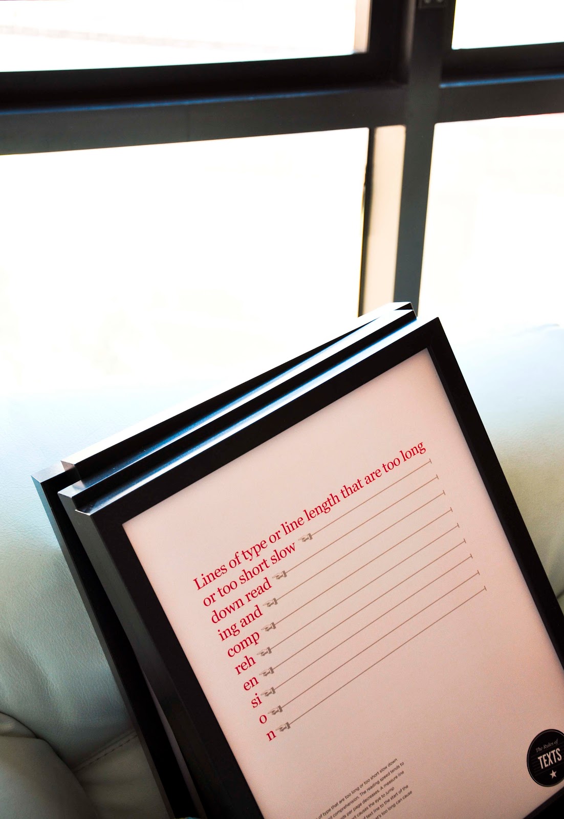
For the other 5 posters, I used the black clips. So, the exhibition would looks lively instead of using 10 frames and it would be looks very boring.

ALL PACKS and ready to Go! :)

4/29/2011
Testing the cheat posters
I tried to do some user testing (while I'm doing my test print) and I find most people understand the message! good!
Below is the possible 2 colors that I tried to print and compare which one is the best for the last final assessment.


4/28/2011
Guide for print body text
For my final outcome, I want to create a useful guideline for designer to understand what's the wrong leading based on the type size. I limit the size only from 8pt to 11pt. This is because my intention is to make designer understand the the long body text (the potential and important one) should not exceed 11 pt.


However, this is a test print.. I'm gonna ask around if there are any of my friend could give me a feedback. Are is this useful for them, are they understand the point... and so on.


However, this is a test print.. I'm gonna ask around if there are any of my friend could give me a feedback. Are is this useful for them, are they understand the point... and so on.
4/27/2011


4/22/2011
Limiting the words
For my survey book, I get inspired by Ghost book. I found this image in internet.. and I thought to eliminating words using the same method.


4/18/2011
Metaphor for Rules book
Thought it would be more exciting using metaphor to explain the type arrangements, alignments and other elements to designers (since they are more into visuals) so I capture a few shots with my friends around studio for this (thanks a bunch all friends who willing to be my model!!)
here is some of the shots:


using people height to show caps and no caps


using people legs to show alignment! hehe
here is some of the shots:


using people height to show caps and no caps


using people legs to show alignment! hehe
4/16/2011
The mood board
before taking picture, it is important to find the 'feel' and framing the object into pictures. Therefore, I researched and created mood board for tomorrow shots.


4/09/2011
Still struggling...
it's freakin' me out! Suddenly my aesthetic values are gone? hiks...
Every time I designing, I always thought about 'this didn't work..' because it isn't align at left, it's not efficient enough...and so on...


Although... the truth is.. this is a poster, not books or body copy..
But thanks to DC roundtable, I guess that where's I finally back to my direction and understand how these posters should be designed.
Every time I designing, I always thought about 'this didn't work..' because it isn't align at left, it's not efficient enough...and so on...


Although... the truth is.. this is a poster, not books or body copy..
But thanks to DC roundtable, I guess that where's I finally back to my direction and understand how these posters should be designed.
4/03/2011
GE Data Visualization
One of interesting visualization by GE Data Visualization that inspired me to create a visualization of reading area survey results. It's really interesting stats to show the CFO Survey results. Here is the link: http://visualization.geblogs.com/visualization/cfo_survey/ They used flash to build this, which make this even more interesting because the area would be overlay as you click the topics. Therefore, I thought of using transparent papers or tracing papers for my survey analysis book.


